Appearance
Data visualization & charts
Charts are a core part of the Supersimple experience, and an invaluable tool for quickly building up intuition about your data.
Charts can be added to any exploration block to visualize its data.
Simple, quick charts
To add a chart to an exploration block, click Add chart on the block itself. Alternatively, if you already have the block selected, you can also find an Add chart button in the sidebar.
Supersimple's charts are designed to get out of your way and let you focus on the data instead of chart configuration.
When adding a new chart, we intelligently suggest a chart based on the data you have available. Instead of starting from selecting a chart type, you start by selecting the data you want to visualize.
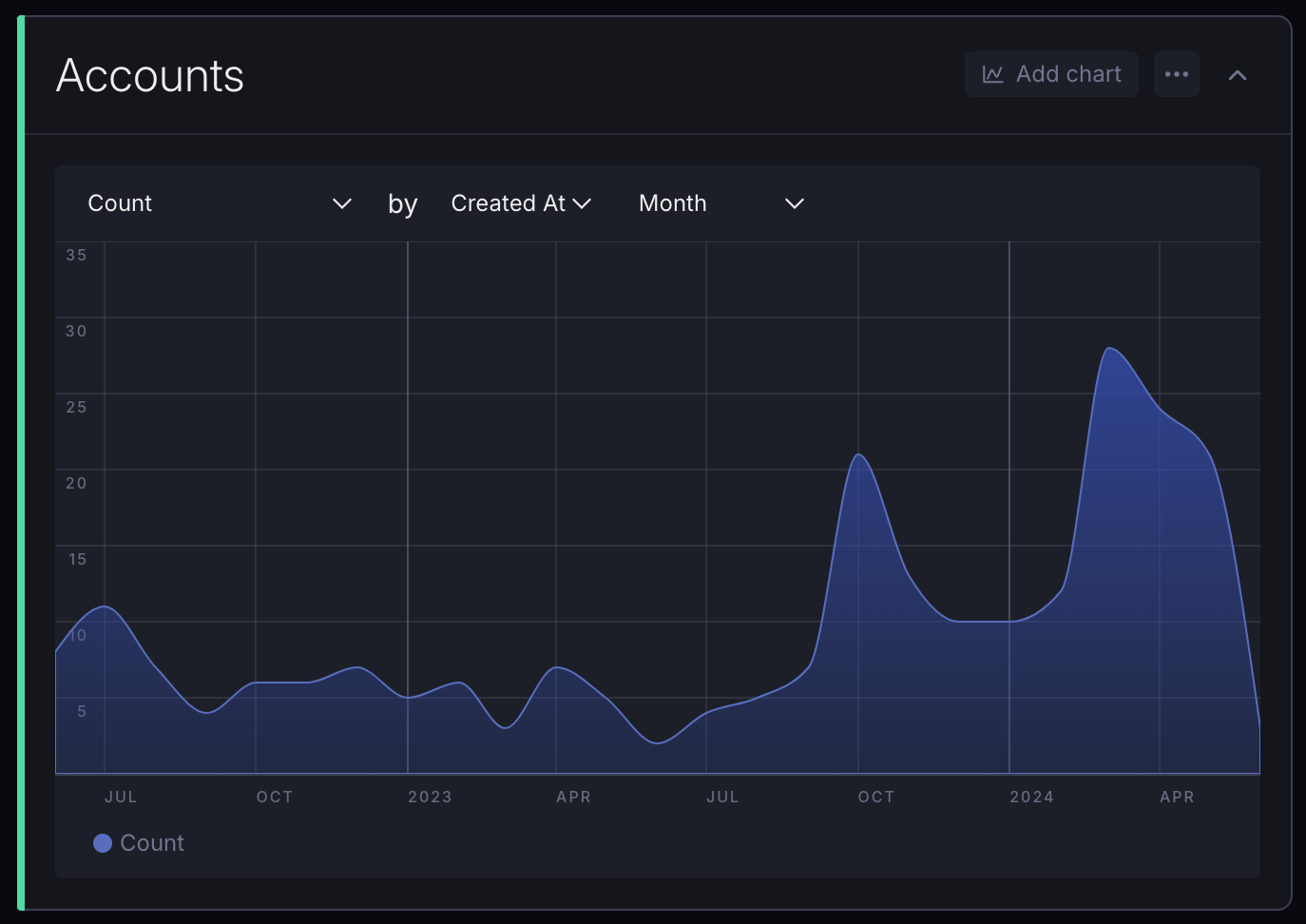
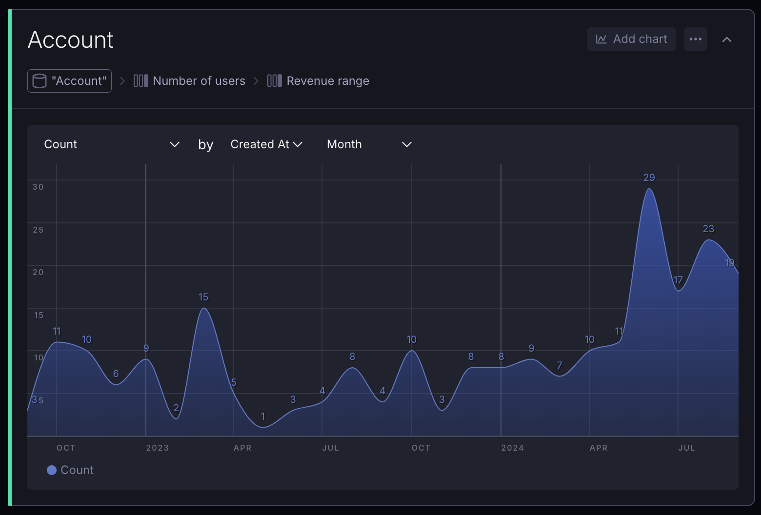
In this video, we start by looking at a list of customer accounts in a table. When adding a chart, it defaults to showing the number of accounts (the Count), broken down by signup month (Created At).
As we change the field we're charting by, the chart updates in real-time. This makes it easy to quickly iterate and explore your data.
You'll notice the chart automatically selects a different visualization type based on the data you're charting:
- When we started out by breaking down the number of accounts by signup month, it gave us a time series chart;
- When we switched to Payment Plan, it gave us a bar chart;
- When we wanted to see how many accounts there were for each user count (Number of Users), it automatically gave us a histogram.
These smart defaults are based on the column types of what you choose to visualize – in this case, the three columns we used were a Date, a text field (String), and a Number.
The basic visualization types that we auto-select are:
- Bar charts for categorical data
- Area/Line charts for time series data
- Histograms for showing numeric distributions
TIP
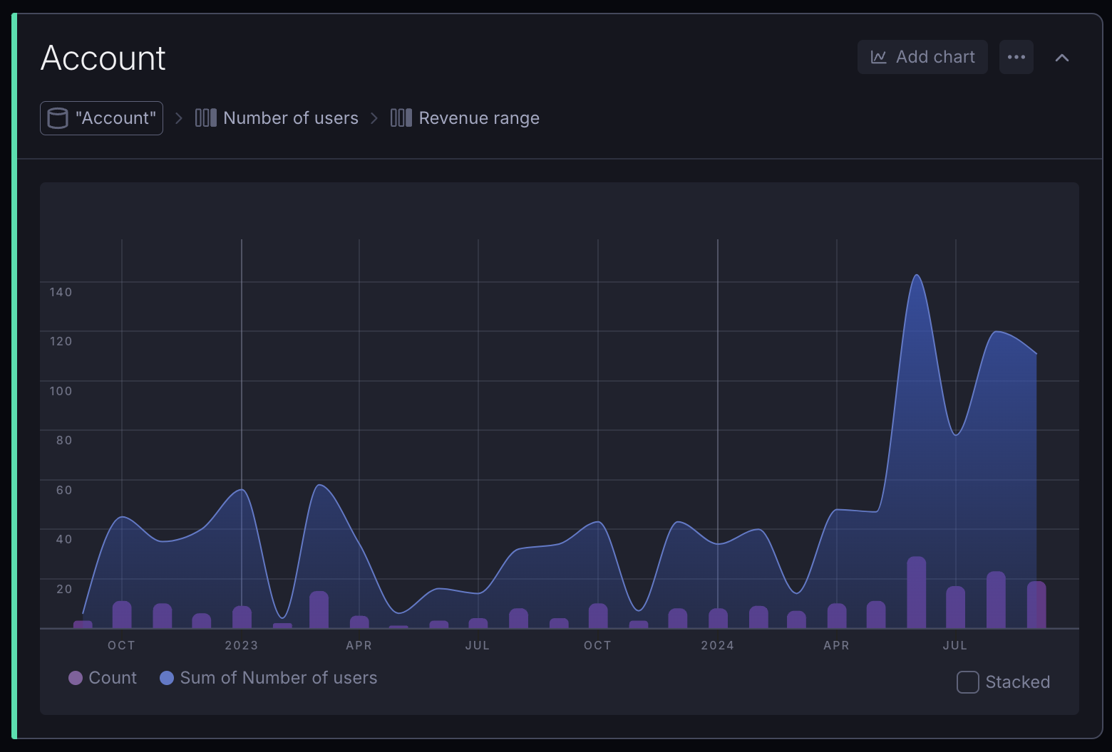
Bar and time series charts can also be broken down multiple times by just adding more Subgroup fields in the sidebar.
Basic chart options
For most use cases, you can just select what you wish to see inside the chart itself. There are a couple of options:
- Type of summarization/aggregation. For example, Count, Average, etc.
- Field to summarize. For example, if the summarization was Average, we might want to choose Number of Users as the "target" in order to see the average number of users per account. Note that this selection isn't necessary if you chose Count as your summarization.
- Field to chart by: for example, if you want to break down your revenue by Payment Plan, you'd choose Payment Plan here.
- Time granularity (only if you're charting by a Date field, e.g. Day, Month, Year).
Charting pre-aggregated data
The above examples assumed your data was in a pretty raw format (in our case, one row per account). However, you can also chart pre-aggregated data – whether you did that inside Supersimple or even in your data source.
In the sidebar, with the relevant block selected, you can turn off the Aggregate switch to immediately chart the data as-is.
TIP
This is useful when you've already done some summarization or grouping in a previous step, or if the raw data was already collected in a summarized form (e.g. "Sessions per day" from a web analytics platform).
When you have Aggregate turned off, you can pick one or more fields to chart, and a Main axis field to chart them by.
Time series chart customization
When dealing with time series data (grouping by a Date field), you can customize the appearance of each individual Series separately.
Here are the key options available:
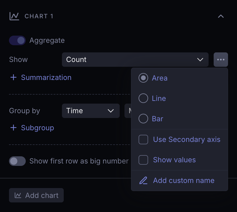
- Chart type: Select from Area, Line, and Bar chart types. You can use any combination of these within a single chart.
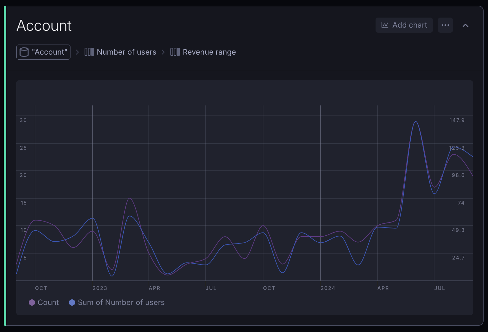
- Secondary axis: Use a secondary Y-axis when different series have significantly different scales/magnitudes. By default, every series uses a single Y-axis and scale. Series that have Secondary axis enabled will scale independently on the right side of the chart.
- Show values: Optionally, you can show values directly on data points. This enhances the clarity of your chart by making key information easily accessible at a glance.
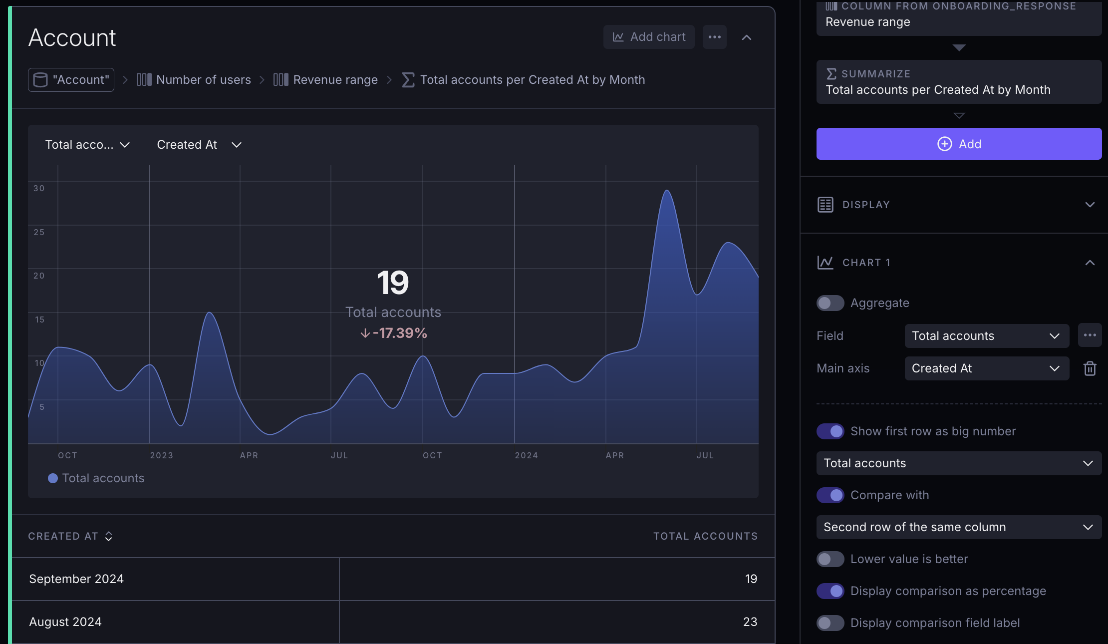
Big numbers
Whenever you have a single number that you want to highlight, you can toggle on Use first row as big number. This is especially useful for KPIs or other metrics that you want to keep an eye on.
On a time series chart, the most recent data point is considered to be the "first row".
In case both Aggregate and Main axis are turned off, you can specify the sorting logic manually, to make sure the big number uses data from the correct row.
TIP
For KPIs, it's often helpful to clean things up by hiding the table from the block's dropdown menu.
The Big number comparison feature allows you to highlight changes between data points effectively. This functionality is designed to provide a clear visual representation of how current values compare to previous ones, making it easy to identify trends and shifts in your data at a glance. Use this feature to emphasize significant changes, helping users quickly grasp key insights and performance metrics.
Advanced options
Using the sidebar, you can also access more advanced chart settings including things like:
- Showing multiple lines or series on the same chart
- Customizing chart types
- Having multiple Y-axes
- Renaming series